This project was our final assignment of the year. We were asked to create an avatar of ourselves. I chose to make myself into a Na'vi person like in the movie Avatar. I created this project using a tutorial, which was very helpful. I used a picture of myself from Spring Break when I went on a cruise. I had a lot of fun working on this project. There were a lot of tedious steps, but I am happy with the end result.
Friday, June 3, 2011
Friday, May 27, 2011
Personal Ad

For this assignment, we were asked to create a piece that showcases our best works from over the semester. I chose eight of my favorite works and centered them around my name and contact info. I used a border to add definition. I added purple frames to my works to make them pop. I applied a texture to my name to make it stand out. Overall, I like how it turned out.
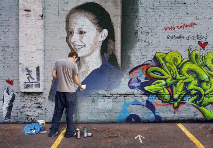
The Memory Project

Wednesday, May 18, 2011
Color Wheel + Stencil Project

For this assignment, we were asked to use stencils to cut out shapes from our own images. Then, we had to apply a photo filter to make a color spectrum across the images (I chose rainbow). We were also supposed to incorporate a gradient effect. I used pictures that I took of various patterns on everyday objects (my backpack, lunchbox, etc.). Then I used various flower stencils to cut out the patterns. I applied photo filters to make the flowers rainbow-colored. I added a stroke to make the flowers 'pop' more. Finally, I applied a pink and white gradient as the background.
Thursday, May 12, 2011
Mascara Advertisement

For this assignment, we were asked to create an advertisement for a product. I chose to advertise Lash Stiletto Mascara. First I found a picture of a cityscape and turned it black and white. I erased the sky so that just the buildings would appear. I added a picture of the mascara and a black stiletto heel. I put a picture of an eye behind the images in the foreground and turned down the opacity. Finally, I added text from dafont.com.
Monday, May 9, 2011
Ran Ortner
Ran Ortner's Open Water

Ran Ortner is a realist artist whose main subject is waves. I find his work very inspiring because his paintings of waves during storms are very dramatic and realistic. He is a very talented painter, and it is easy to mistake his paintings for photographs.
Tuesday, May 3, 2011
Bionic Lady Gaga

For this assignment, we were asked to create an "inside-out" image. I used Lady Gaga as my subject and turned her into a bionic woman. I used a computer hard drive for her sunglasses and a computer chip for her face. I used an overlay to make the computer chip and the lips blend smoothly with the original face. I turned her hair blue using an overlay.
Wednesday, April 27, 2011
Impressionist Painting

For this assignment, we were asked to turn a regular picture into an impressionist painting. I used a picture that Alicia took of a bumblebee. First I applied some photo filters, and then I used various brush strokes to make the photo appear more like a painting. I spent the most time messing with the brush strokes.
Monday, April 25, 2011
Comic Strip

Wednesday, April 13, 2011
Chair Artwork

For this assignment, we were supposed to use an image of a chair and "reupholster" it using PhotoShop. We were also supposed to add a shadow. I used Van Gogh artwork. The shadow was probably the most difficult part.
Kaleidoscope

This assignment was a kaleidoscope effect project. We learned how to create this effect by watching a YouTube tutorial by a 15 year old boy. I started with a picture that I took at school and followed the steps in the tutorial to figure out how to make the kaleidoscope effect. After I duplicated and arranged the images to make them seem like a kaleidoscope, I adjusted the color balance and added a filter.
Tuesday, April 12, 2011
Midterm

This assignment was for our midterm exam. We had to create a 7" x 5" grid of pieces of pictures and use a variety of Photoshop tools. We were supposed to incorporate the Elements of Art and Principles of Design. I used a somewhat limited color scheme, formal balance, and a symmetrical pattern. My main Principle of Design was symmetry.
Tuesday, March 22, 2011
3x3 Self Portrait

For this assignment, we were asked to create a self-portrait using a 9 square grid. The first step was to take 3 pictures of myself. Then, I placed them in Photoshop CS5 and arranged them in an evenly spaced 3x3 grid arrangement. I added purple lines to use as a guide. Next, I applied filters to each of the pictures. I adjusted the color in each of the pictures for each color of the rainbow. Finally, I added a border using pictures that reflect me. I used pictures of the beach, the Eiffel Tower, Greece, and the Great Wall. These are all places I have been to, and really enjoyed. I also used flowers because I love colorful flowers.
Thursday, March 17, 2011
Photofunia.com Review
Photofunia.com is a really fun website to just mess around on. It doesn't take much skill and is easy to navigate. The final product is really cool. All you have to do is upload a picture and PhotoFunia will do the rest of the work for you. Some of the effects are really neat. If you are short on time and don't want to spend hours applying various effects to an image to get the desired look, PhotoFunia is a great site that can produce an impressive final product with virtually no work involved. People who are looking for something fun and easy to do should use PhotoFunia. I think this website should be put on Mrs. Burnette's webpage, but only as a fun, "messing-around" type thing to do, seeing as it doesn't really require any artistic talent or ability.


Wednesday, March 16, 2011
4 Square Project
For this assignment, we were asked to create a Photoshop work using the four quadrants of the canvas. We were also supposed to apply filters and alterations in color. To create unity, we were to use the same image in each of the quadrants.

For these images, I first rotated the various pictures so that they were not all facing the exact same direction. Then I played with the color balance on each of them. I applied multiple filters to them, especially on my rubber ducks image. To add definition and clarity, I added lines to separate the four quadrants.

Tuesday, March 8, 2011
Visual Puns
For this assignment, we were asked to create four "visual puns" by combining imagery into one object. We were also asked to experiment with some new techniques, such as threshold, posterize, gradient map, and overlay, and to creatively incorporate text into the final product.

"HOUSE FLY"
In this visual pun, I combined a house with a set of wings, which I then applied the gradient map effect to. I used the drop shadow effect on the letters. I posterized the background (sky). I used the overlay effect on the ellipse behind the text. My text came from dafont.com.

"SMART CAR"
For this visual pun, I combined a smart car with a brain. I posterized the background. I used the text warp tool to make the text curve around the brain. I added a light bulb, too.

"HORSE RADISH"
In this visual pun, I combined a horse with a cartoon rider with a radish head. I posterized the background and the radish. I used fonts from dafont.com.

"MONKEY BUSINESS"
For this visual pun, I replaced the businessman's head and hands with those of a monkey. I used the threshold effect to make the image black and white. I used the text warp tool to make the text in the shape of an arc.
Thursday, March 3, 2011
Abstract Works

For this assignment, we were to create 2 abstract works, as inspired by the movie "My Kid Could Paint That". I used a website called jacksonpollock.org to create these works. On this website, you simply drag your mouse across the screen at varying speeds and click to change brush colors. Then, I imported the screenshots into Photoshop CS5 and added some brush strokes.

Friday, February 25, 2011
Negative Space: Me

We were asked to create a second negative space project that reflected our personalities. I chose a picture of me doing a cartwheel and replaced the original image with a swimming pool pattern. I replaced the original background with some sand. I added a word poem from wordle.net that reflected my personality. I added the drop shadow and bevel-emboss effect. Finally I added a floral border.
Negative Space: Hawk

For this project, we were asked to use an image to create negative space as opposed to a detailed object, as well as incorporate text into the final product. I chose to use a hawk. First, I replaced the original hawk with a sky during sunset and added a brush stroke to make it stand out more. I also placed a gradient overlay on the hawk to increase the dramatic effect. Then, I added a daytime sky as the background. I found a haiku online about a hawk and added it to the background. Finally, I created a word collage using wordle.net and placed it within the hawk.
Friday, February 18, 2011
Crazy Combo

For this project, we were asked to create a crazy hybrid creature using parts of many different images to create a finished product. I used a zebra body to start out with. Then I added elephant legs, a cheetah tail, swan wings, a giraffe head, cat eyes, and donkey ears. I used the eraser tool a lot, often accompanied by the new refine edges feature in Photoshop CS5. I used the puppet warp feature to bend the elephant legs, the cheetah tail, and the giraffe head. Finally, I added the background and the text and adjusted the size of my creature, the "Africanimal".
Friday, February 11, 2011
Renaissance Woman

To create this image, I used a Renaissance portrait that I found on google and replaced the original face with my own. First, I had to carefully cut out my face. Then, I had to texturize the picture of my face to make it match the texture of the painting. Finally, I had to adjust my skin tone to match the skin tone of the woman in the painting. This was the most difficult part. Overall, I am satisfied with the way the portrait turned out.
Thursday, February 10, 2011
15 Green Things

For this project, we were given fifteen green objects and had to arrange and manipulate them in a way that we found interesting. The primary tool I used in this project was the color replacement tool. I also used scaling, skewing, and rotating to arrange the images. I adjusted the opacity on many of the images. When working on this project, I took a more realistic approach, as opposed to abstract.
Friday, February 4, 2011
Background Replacement

We took a short trip to China in Digital Imaging today! Just kidding. I created this image in Photoshop CS5 by replacing the original background with a picture of the Great Wall of China. I used the magnetic lasso tool to erase the first background and then used the eraser to touch up some bumpy edges. Then I added the Great Wall as a layer behind the people. Finally, I lightened the people so that they would look more natural in the lighting of the background.
Tuesday, February 1, 2011
Music Project

We were given a set of images and manipulated them by using various tools in Adobe Photoshop CS5. I rotated the music notes and rearranged the object layout to make the image balanced. I changed the appearance of the colored stripes by using the eraser tool. I applied a filter to the musicians and the music notes to give them an interesting, different texture. I posterized the image to increase the contrast and brightness of the image. Overall, I am satisfied with the way the image turned out.
History Brush: Bird

I created this edited image by using the history brush in Adobe Photoshop CS5. First, I desaturated the image and then I used the history brush tool to add the color back to only the bird to make it stand out. The bright colors of the bird make it a perfect image to experiment on with the history brush tool.
Subscribe to:
Posts (Atom)